Wednesday, 30 December 2015
Sunday, 20 December 2015
Friday, 18 December 2015
Ancilliary Draft Planning

Monday, 14 December 2015
Saturday, 12 December 2015
Friday, 11 December 2015
Thursday, 10 December 2015
Monday, 7 December 2015
Do's and Don't's of design work
When it comes to design work, there are a number of things which should be done. However, there are many things which should not be done when forming a design. Below, I will be explaining what should be done in design work and what should not be done in design work.
1. Do: Apply contrast to the work
It is important that the design work consists of contrast, especially when it comes to the typography or even the background. Also, when it comes to the chosen font, it may be beneficial to use a range of different font weights such as bold or light.
2. Do: Make sense of the work
It is crucial that the design work makes sense. The design work should be made for a specific purpose instead of only making it look good. The work should be understood no matter how many layers or fonts are used within the design work.
3. Do: Use smart guides
As technology has developed over the period of years, we have been introduced to a number of drawing softwares. Due to this, we are able to form our work correctly and it prevents us from making huge mistakes within our design work. Therefore, it is crucial to use softwares which will benefit the construction of the design work.
4. Do: Leave place between the words
There should be space between the letters, lines and paragraphs in design work. It is important to identify whether the design work is readable.
5. Do: Carry out research on different techniques
Design changes each year. Different designs and typography is seen everywhere, in advertisements, billboards, even on the streets. Researching on new trends and techniques will allow old as well as new techniques to be used within the design work.
1. Don't: Use too many fonts
Fonts used in design work should be picked because of a specific mood. At least two to three fonts should be used to keep the design professional as well as clean.
2. Don't: Go too extreme with the design work
The design should be known beforehand, as it will help to form the design in an easier way. The direction at which the work is going should be known, not only with typography but with the entire work. Therefore, the design work should not be overdone.
3. Don't: Depend on the effects of Photoshop
The effects of Photoshop should not be depended on. Photoshop should be used when necessary, in order to improve work. When the effects of Photoshop are used, the different options should be played with until the final project is correct.
Photography Plan
Primary Photographs Needed
1) Mid-Shot of Main Boy leaning against the wall (Used for CD front cover), wearing long-sleeve shirt with v-neck, face facing towards camera, body at 45' counter-clockwise
2) Evelina and boy giggling, shallow focus, close-up of faces from left hand side, boy wearing long trench coat, navy coloured. Girl wearing hoodie (Used for website)
3) Long shot of empty highway, or empty street during dusk or day (cloudy and dark), boy with hoodie on, walking away from camera. (Front cover of Digipak or website)
4) Close-up, half of boy's face, one in light and the other in shadow, looking towards camera, black and white filter, v-neck top (Back cover of CD digipak)
Secondary Photographs (May not be used)
1) Broken frame, close-up (Used for Website)
2) Mid-shot behind Evelina and boyfriend, two holding hands (Used for website)
Storyboard

The beginning shows the shots used and approximately how long they will last. The storyboard can help us visually in what we need to do for it to finish as close as possible to the storyboard. As a typical storyboard has, the additional notes are present in order to give us extra guidance as opposed to just visual art. I added exact seconds and this strict timing can help us edit it more professional and make it flow easily.


Saturday, 5 December 2015


Friday, 4 December 2015
Sunday, 29 November 2015
Friday, 27 November 2015


Sunday, 22 November 2015
Friday, 20 November 2015
Thursday, 19 November 2015
Revisions to pitch and final decisions
As part of our research into forming our final media product, we had made a Pitch. In the pitch, we had received views and opinions from our target audience about what they had thought of our narrative, as well as what should be changed.
Some of the feedback we had received from pitching our ideas for our music video was extremely beneficial, as it had been something which would have been useful to include to make our final media product effective as well as entertaining to watch.
Below are some of the responses we had received, we had picked these out of all as we had believed they were the most useful.
1. Add a twist into the music video, such as a flashback.
2. Add more shots; such as close ups and long shots.
3. When the protagonist finds out he's been cheated on, he should punch the antagonist.
After taking the comments into account, we had gathered as a group and discussed what type of changes should be made to our narrative regarding our target audience's comments.
For example, we will be including flashbacks within the music videos in order to show what problems had occurred between the protagonist and his girlfriend. For e.g. he will get flashbacks of the memories him and his girlfriend had shared. We also decided to feature a variety of shots, such as long shots. One shot we particularly wanted to use was a long shot for when the protagonist is seen singing the song. Also, when it comes to the protagonist finding out he's been cheated on, we wanted to include a specific reaction. For example, we have decided to make sure the protagonist punches the antagonist. This will show that no matter how down to earth his character may be with his girlfriend, he still has a side to him which is violent.
However, there were some ideas which our target audience did not mention in the response to the Pitch; we had formed these ideas by ourselves. We had decided to include metaphors, these metaphors will signify the heartbreak and feelings of the protagonist. For example, a glass breaking to connote the heartbreak which the protagonist feels after finding out he has been cheated on. Another metaphor is of the protagonist and his girlfriend's photo disappearing in the wind right before she cheats on him, in order to signify that she is about to cheat on him.
Wednesday, 18 November 2015
Tuesday, 17 November 2015
Wednesday, 11 November 2015


Monday, 9 November 2015
Website Draft

The website draft is of a simple template, and the colour scheme will be predominantly white text on black to have a sharp sense of contrast. This can target a wider range of audience since people who might have sight problems can easily see the text, since the colours do not distract them. I based my website on Adam Lambert's official website, and the buttons are in the same layout as Lambert's, and it helps because his website is very simple. His pictures take up the whole width and this instantly attracts the viewer. His pictures consist of monochrome pictures, natural lighting, sepia, processed and noir filters, and this large variety of photography can show to the audience the skills that he possesses, and this shows that he is full of talent.
Friday, 6 November 2015
Analysis of Conventions
Making drafts of our ancillary tasks was a rather easy as well as challenging task to complete. For example, as we had been given the task to make a storyboard, digipak along with a website or magazine advert; it was a thoughtful process to decide what storyline as well as codes and conventions to include on both the ancillaries along with the storyboard.
I had began by making a storyboard which revolved around the storyline which I had thought of regarding our music video. We were given the task of drawing out our storyboard in order to get a realistic view of what the storyline would be, and why we had chosen the narrative we had chosen individually. For example, when it came to my narrative; it had included a storyline of the main character being cheated on by his girlfriend and one true love with another boy. After finding out about being cheated on, the boy leads on to attempting suicide. Although I had drawn out my storyboard, I also wanted to get a visual effect of the storyboard. Therefore, I had made a storyboard online to get an effective along with a realistic view of my chosen narrative. I had uploaded both the hand drawn storyboard, as well as the online made storyboard onto my blog.
When it came to my first ancillary draft task-the digipak, I had began by drawing out a digipak with four panels. As a group, we had made changes to the song we had began by choosing. Therefore, we also had to make a couple of minor changes to the our ancillary drafts such as the name of the song. Like the storyboard, I also wanted to get a realistic view of my first ancillary draft; therefore I had formed one on Photoshop. Even though my Photoshop skills are not the best, I still wanted to get a realistic view of how my digipak could possibly turn out as a final piece. I knew this would be beneficial, as it can help me to make my final digipak piece effective and better.
For my final ancillary draft
task, I had started off by wanting to make a website as my second ancillary task. However, as our coursework had progressed I had changed my mind and decided to make a magazine advert instead. Since I had already shown both my ancillary drafts, along with my storyboard to the focus group I knew it was important that I included both the website draft as well as the magazine advert draft. As I had changed my mind rather quickly, I didn't think it would be necessary to get a visual effect of the website; therefore I had only formed a digital draft of the magazine advert on Photoshop to get an effective and realistic view of it. I knew this would be beneficial as my target audience would be able to identify what is expected, and what I should do to make my final magazine advert better.
Drafts of Ancillary 2

This is my first draft of my second ancillary which is a website. I personally wanted the main singer to be the center of attention on the website. Also, if the audience come across the website, not only would they know whose website it is because of the title but they will also know how the artist looks.

As I had changed my mind on my second ancillary, I decided to make a magazine advert instead of a website. After looking at a range of different examples of magazine adverts, I personally thought making a magazine advert would be best to make.

Although I had drawn a draft of my magazine advert; I also wanted to get a visual effect of how the magazine advert could be formed after it is made. Therefore, I had made a magazine advert draft on photoshop in order to identify what my magazine advert could possibly look like once it is finally made.
Drafts of Ancillary 1

This is a draft of my digipak. I wanted the front cover to have a picture of the main artist, in order to show everyone how the artist looks. After research many digipaks, I did realise that many artists do not always include a picture of themselves on the front of their digipak. Although, I wanted to do something completely different.

After drawing a digipak draft by hand, I also decided to make a similar draft on photoshop in order to identify what my real digipak could possibly look like.
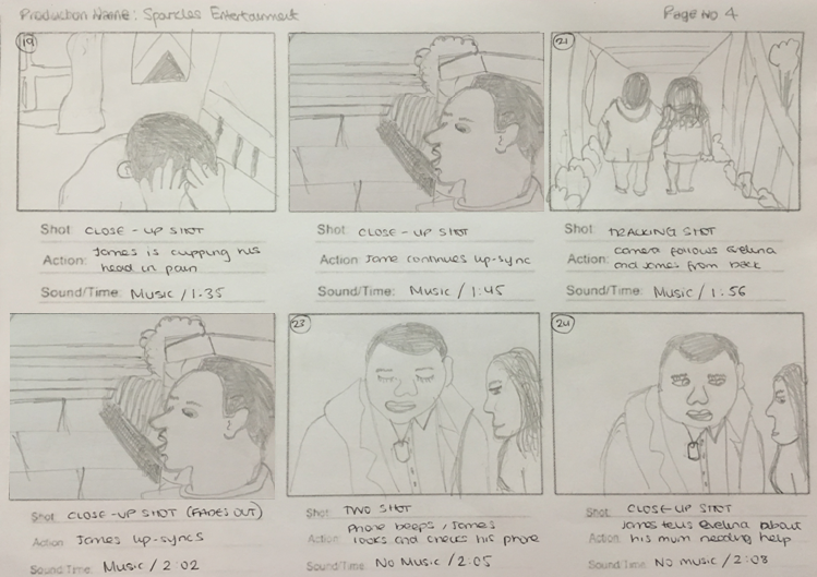
Storyboard
This is the storyboard I had created as part of an idea which I wanted as part of our chosen song. Choosing many of the shots and angles in my storyboard, was because of the ways in which I wanted the storyline to have an affect on the audience. For example, an extreme close up will show the emotion of a character.
Through forming an individual storyboard, I was able to identify what possible shots may be useful when it comes to the actual production. I had identified that I included a range of close up shots as the storyline I had formed was included drama and romance, which meant that the character will need to show a range of emotions. Because of this, I wanted the audience to get a better look on how the character would feel in certain situations; and feel something towards the character.


Although I had made the storyboard by myself, I also wanted to form a storyboard online so a realistic view is shown through animated characters.
Made with Storyboard That
Made with Storyboard That
Made with Storyboard That
Made with Storyboard That


Although I had made the storyboard by myself, I also wanted to form a storyboard online so a realistic view is shown through animated characters.

Made with Storyboard That

Made with Storyboard That

Made with Storyboard That

Made with Storyboard That
Tuesday, 3 November 2015
YouGov Profiler - Years & Years
After carrying out research on YouGov Profiler, I was able to find out more about the fans of the band Years & Years. The three images below show the demographics, lifestyle and brands of the fans of the band. This research will be beneficial when it comes to forming our final media product, as we will be able to target the correct audience for our music video.


Sunday, 1 November 2015
Saturday, 31 October 2015
Thursday, 29 October 2015
Previous Student Music Video Review: Powerless - Flow Motion Films
https://www.youtube.com/watch?v=4BYZlsnve9g
Powerless - Flow Motion Films
After analysing a music video made my previous A2 students, I had identified a range of different elements which I had enjoyed extremely.

When it comes to camera, the music video had started off with a tilt. I enjoyed this particular shot extremely as we were able to see a beautiful view which the main actor of the music video was looking at. I personally believe that this particular shot had given out a metaphor; its him against the world.

Another element which I had enjoyed watching within the music video was the editing. As the main actor is seen having flashbacks of a boxing match he had been in, it was rather beneficial to use a grey colour to help the audience identify the flashbacks.

This particular scene was extremely beneficial to use within the music video. This is because it had shown what the main actor had experienced as a child, which is why he was in a boxing match.

Due to the use of a hand held camera in the scene where the main actor is getting beaten up by the bully, it had made the audience believe that they were experiencing it. This was an excellent use of camera as it had given the audience a realistic view of the main actor's life.

When it came to the ending of the music video, the main actor gets defeated by his bully during a boxing match. When the main actor collapses, he begins to get flashbacks of his bullying experience which motivates him to get back up and complete the boxing match. Not only was there a good use of camera and editing at this point in the music video, but it is also seen as a motivation for viewers who can relate to the main actor's storyline.
Sunday, 25 October 2015
Friday, 23 October 2015
Target Audience: Mainstream vs Independent
APPEAL TO TARGET AUDIENCE
|
||
INDEPENDENT
|
MAINSTREAM
|
|
Mise-en-scene
|
Local or simple locations
e.g. streets,
|
Expensive locations e.g.
famous cities,
|
Editing
|
Least amount or no special
effects
|
Extravagant special effects
|
Camerawork
|
Restricted shots due to
equipment and budget
|
Various shots e.g. bird’s eye
view using equipment
|
Sound
|
Low quality use of equipment
or sometimes hired
|
High quality sound systems
and equipment
|
Actors
|
Unknown actors
|
Well known/ Famous actors
|
Budget
|
Low budget
|
High budget
|
Marketing/Promoting
|
Word of mouth or enter music
festival to hope their work is recognised by winning an award.
|
TV, DVDs, magazines, posters,
internet, radio
|
Distribution
|
Limited release, direct to
DVD
|
Internationally
|
Exhibition
|
Local cinemas, if not any
|
Wide scale internationally
|
Wednesday, 21 October 2015
Tuesday, 20 October 2015
Previous Student Video's Analysis


Looking back at both the music videos, I feel that there is
a lot to learn from both of them whether it’s something that we could take on
for our music video or something we could avoid. However, while creating our
music video the different elements we were take into consideration will be the narrative,
camerawork, editing, mise-en-scene and the actor.
Monday, 19 October 2015
YouGov Profiler - Years and Years

As you can see from above, the YouGov Profile shows
different aspects of the fans for ‘Years and Years’. The demographics of Years
and Years are mostly female between the ages of 18-24 in the North East whom
are fashion designers. We could break this stereotype by promoting the music to
both males and females.

From the above
screenshot, you can see that the fans lifestyle consists of many different
components such as food, sports, interests and hobbies. It’s visible that most
fans like listening to music and like music in general which can benefit us
when we make our music video.

The fans have different
personalities that could lead them to doing different things. However, one
thing in common between all the Years and Years fans is that internet is the
main source of information for them as well as listening to music. As you can
see from above, the fans seem to be moody, needy and miserable on occasions. We could create a video that will have sense of
love and being miserable which could allow the fans to relate it
back to themself.

The fans of Years and Years are customers of many different
brands which you can see from above. Most of these are social networking sites
that most individuals use such as Instagram, snapchat, twitter etc. Taking this
into consideration, I could create social networking sites for my artist in my
ancillary productions and create its track list.

From above, the fans
of Years and Years watch different entertainments such as movies, tv shows,
listen to other music artists and watch different celebrities. You can see that
these fans have a wide range of entertainment which shows their interest in
media.

The fans of Years and Years most common source is the
internet. As you can see, they go onto many different online websites such as
facebook and twitter where they get updated with latest information about music
or certain music artists. Keeping this in mind, I could promote my music video
via social networking sites which will increase the artists’ identification.

These fans also read
newspapers and magazine where they get latest updates as well as watch TV shows
such as family guy, don’t tell the bride, dinner date etc. This gives me an
idea of love as a theme as most these TV shows are related to the theme of love
which I could use for my music video.
Thursday, 15 October 2015
Album Cover Draft


The layout of the CD is the typical 4 squared template; front, inside (consists of 2), and back cover. The inside consists of an image of the main character on the inside leaning against the wall, a mid-long shot maintained and he looks at the camera. The left hand side of the inside has extra content showing tour dates and locations. The back will be white on black, keeping to the same colour scheme as the website, and the typography will be simple, using a Sans Serif text
Subscribe to:
Comments (Atom)