Showing posts with label F: Ancillary. Show all posts
Showing posts with label F: Ancillary. Show all posts
Monday, 29 February 2016
Audience Feedback on Final Digipak
As you can see from the above audience feedback based on my final digipak. The audience liked that I had a consistent background for all my pictures which helped all the pictures to blend with one another and prevent it from looking odd or unusual. In addition to this, the target audience also liked the idea of having quotes in the digipak as this can influence other individualas as well as prevent the audience from being bored just by looking at the pictures. The use of colour was a major factor that impressed and satisfied the audience. When taking these pictures, I ensured that I could somehow edit or manipulate these images for them to go with one another.
On the other hand, I did ask for improvements as if in the future I had to create something like this, I will be aware of what to avoid and what other things I could add to my production for me to go a bit higher. Some of the improvements I received was to add bright colours which could stand out, However, I personally felt that this would not go well with my music video and website as our production didn't really have a lot of brightness in there. In addition to this, I was told to use a variety of images to promote the artist and video by maybe adding pictures of other artists as my digipak was only focused on one character who was the main lead in the music video. My audience also told me to make the text bigger so that it was clearly seen and visible for the audience to rescognise.
Overall, the audience felt that the digipak was quite appealing and attractive.
Audience Feedback on Final Website
By looking at the analysed surveys in the video, you can clearly see that all the participants that took the survey had loved the website. The reason for this was that they felt it was user-friendly, easy to use, good use of colours as well as the navigation which was easy to understand. Everyone liked the layout of the website as it wasn't complex to understand as it was clear and straightforward.
However, there were a few improvements I was told to make for future reference. This included having images or trying to involve the audience on the "About Page" as it looks really dull with one picture and writing about the artist. The audience also felt that the size of the writing should be bigger which could show emphasis on something particular on the website. In addition to this, they felt that the colour of the website should be changed as I had used dark colours such as Black, White, Grey and Brown. I felt that this was a major change I could do in the future as this could not only prevent the audience from being bored, but it can also make the website livelier.
Overall, the audience found the website excellent and rated it between good to very good which can show that I did meet most of the needs of the audience.
Saturday, 20 February 2016

Thursday, 18 February 2016
Digipak and Magazine Advert Audience Feedback
Below are images of the feedback I had received after completing the music video as well as my two ancillary tasks; the Digipak and Magazine Advert. Here are the responses I had received.


Wednesday, 17 February 2016

Monday, 15 February 2016
Improvement Feedback for Draft Ancillary Tasks
Digipak in Progress Feedback

As you can see from above, I had received many different feedback in regards to my digipak. My audience felt that I had nice pictures taken of the artist as it stands out from the digipak as well as having the consistency of the background in all images. This was said as I took all my pictures in one location which I could then put together and show a flow of images instead of them being different which can affect the audience's interest. In addition to this, some of my target audience liked the use of black and white images however some felt that this looked a bit dark and dull which could distract the audience's interest and engagement in the digipak.
On the other hand, I also received feedback from which I could improve my digipak on and satisfy my audience. Some of the feedback I received was to change the colour of the writing as you couldn't really see it well enough which could prevent the audience from buying the digipak. In addition to this, they felt that the picture of the guitar (top left corner) didn't go well because of the way it had been taken. Therefore, I have been told to replace it with another picture which could have some identification of the background of the location.
Website in Progress Feedback
By looking at the above slideshow, you can clearly see that my audience feedback were happy with the way I had used the different shots of pictures to show the artist. As well as this, they liked the title as it stood out due to the font size. In addition to this, my audience liked the structure of my tour page as they are able to be updated with events that have taken place or are going to.
In regards to the improvements, my audience felt that the handwriting font is a bit unclear to see and the colour is a bit too dark. Due to this, they feel that I should have brighter colours and make the font size bigger or bold. In addition to this, they felt that there was a lack of music videos about the artist on the webpage. They also feel that I should make improvements to the contacts page as it isn't clear about contact who and for what e.g. Booking etc.
Saturday, 13 February 2016


Friday, 12 February 2016
Thursday, 11 February 2016


Wednesday, 10 February 2016

Digipak (Print Media)

My digi-pak consists of dark colours to give a sense of abandonment and loneliness. Although this isn't typical of conventional pop CD covers such as Taylor Swift's Fearless or Miley Cyrus' Wrecking Ball. I subverted from these pop conventions and this makes it intriguing and interesting to the audience as they believe that this new artist is groundbreaking and influential. Because of this, I can target different demographics instead of my initial target audience of young teens to adults of both genders, coming from a working class to middle class background. The bottom three panels show a story, where he is shown being separated from a dark, shadowed figure, presumably his past. The bottom middle panel shows him with his hand on his head, possibly thinking about what happened. My digi-pak shows a story and the consumer would immediately know that this album is about heartbreak.
Tuesday, 9 February 2016
Magazine Advert (Rough Draft)

After completing a rough draft of my magazine advert, I decided to receive some feedback from my target audience. I wanted to identify what part of my magazine advert looked good, what improvements could be made as well as what could be added. Below are some of the responses I received.


Digipak (Rough Draft)

After completing a rough draft of my digipak, I decided to receive some feedback from my target audience. I wanted to identify what part of my digipak looked good, what improvements could be made as well as what could be added. Below are some of the responses I received.


Monday, 1 February 2016

Saturday, 30 January 2016
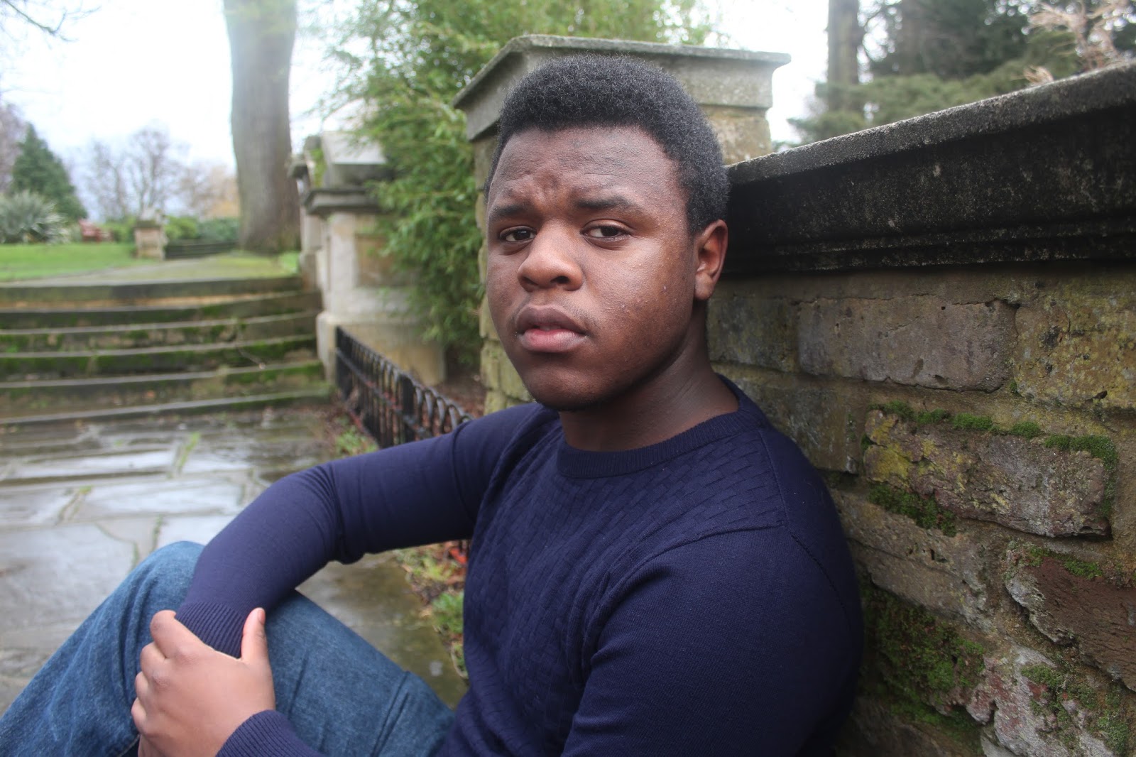
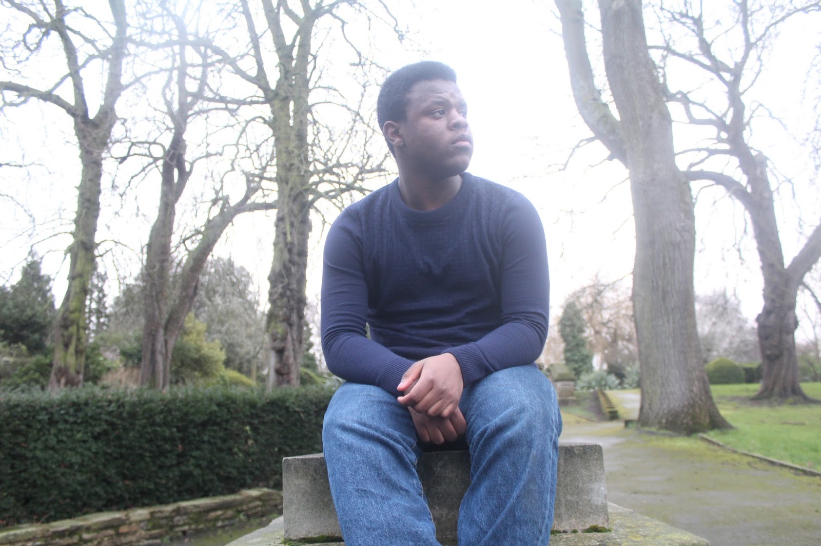
Photography Plan For Ancillary Tasks
These are the pictures I have planned to use for both my ancillary tasks. I felt that these were suitable for my ancillary tasks as after researching I found out that most digipak have close-up shots of the artist which allows them to be identified. In addition to this, there is usually a background of the location or a colour residing the whole theme colour. For mines, I felt that I wanted to use the location as this would have gone well with all my pictures that were taken in the park. I wanted to show the significance of the guitar in the artist’s life therefore I took a close-up shot of this to show the meaning behind it. Moreover, I wanted the artist to be in different poses in the location which can reflect and give a hint about the album that is coming out.


Photography Plan for Ancillary Tasks
I personally believe that having a photography plan for our ancillary tasks was beneficial. The photography plan had helped to recognize what type of photos could possibly be used within the ancillary tasks. Below are some of the photos I had taken as part of my photography plan, along with some pictures which I will be using for my digipak and magazine advert.
 |
| A high angle |
 |
| A mid shot |

A close up

A long shot
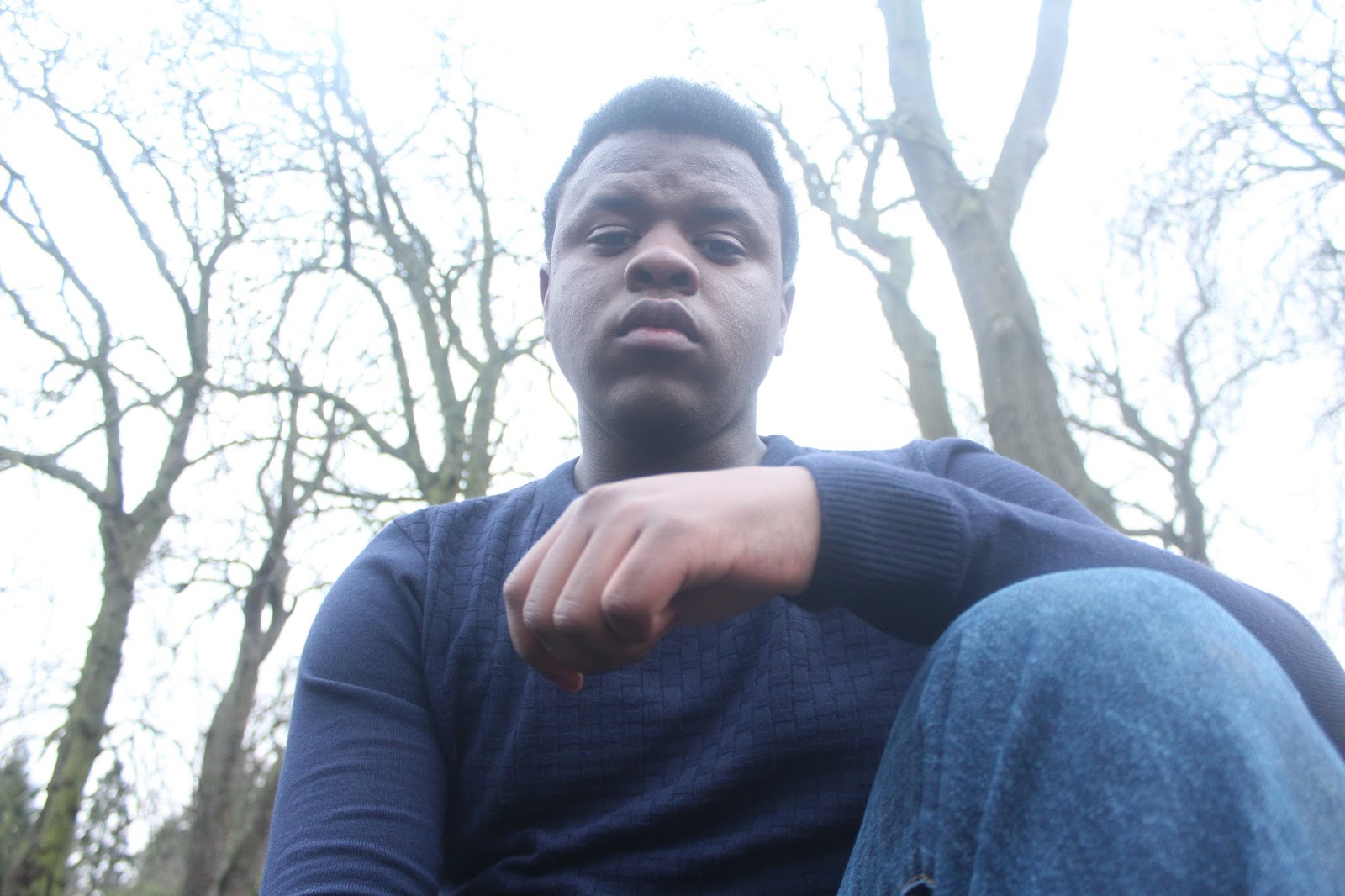
A low angle
 |
| A mid shot |


Subscribe to:
Posts (Atom)